2 Tips That Will Improve Your Snaps

These days, everybody is a photographer. With cameras attached to seemingly everything, capping snaps is inevitable. Unfortunately, that means there is now a huge percentage of the world's population taking photos of anything and everything with little to no understanding of the most basic rules (guidelines if you will) that make a "good" photo. My communication 101 professor in college used to say that communication is one thing you cannot improve by simply doing it more, photography is the same. You need to understand the fundamentals and use that as a foundation on which to build your creative genius...yes, that means you Mr./Ms. Instaphile!
Note: All photos used in the examples below were taken with an iPhone and edited on Instagram
1. CROPPING/FRAMING AND CENTERING A SUBJECT
Let's start by going over what could be the most classic framing technique in photography, centering a subject. You see a car you want to capture, you put it roughly in the center of the frame and snap, you cap it. Easy enough right?
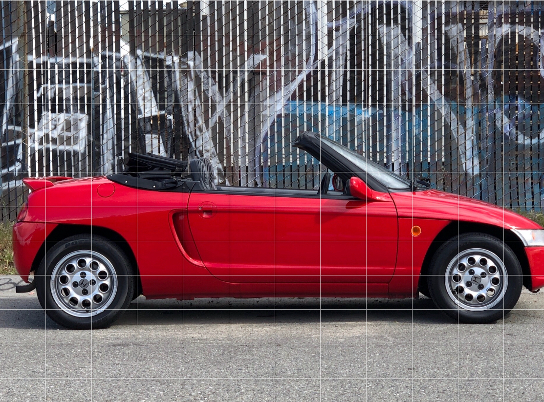
Without getting too fancy, I got low, I centered this Honda Beat in the frame (my phone screen) and took about 5 shots of the same exact angle--I always advise you take more than one photo of the same thing to better your chances of capturing The One. You never know, something could walk into your frame, background, your eye may itch, or you are a shaky mofo.
In instagram, you add the photo and hit edit...

- With the grid overlayed on this image (from the adjust tab), you can see that there is less space in front of the car than there is behind it.
- You can also see that the car is not perfectly in the center of the image from top to bottom. That is not necessarily an issue. We will get to that in the "Rule Of Thirds" section.

- Using the grid for guidance, you zoom in to "crop" the image and even out the space behind the car to match the front.
- This looks like a good amount of "breathing room" around the car and is OK as is, but one might say that the structures at the top of the image are distractions and are not really adding to the image.

- Zoomed in a bit more, the top structures become less visible and the car "pops", as you fill the frame with your subject.
- There is still enough breathing room around the car.
DO THIS:
Good space around the car, yet zoomed in enough to get a good look at the details and shape of the car. Any tighter than this and you begin to "suffocate" the car

DON'T DO THIS:
Suffocating your subject is an easy way to ruin the balance of an image. The observer will feel "stuck" staring at the center of the subject. You want observers to flow around the image and take in the different areas and most importantly, the details on the car. Without breathing room, you limit this significantly. Also, this makes both Lane and I very anxious leading to an elevated heart rate. Stop it!

DON'T DO THIS:
Chopping off the ends/corners of your subject. This is very common and looks very sloppy. It is usually also accompanied by an excessively tight crop. This is distracting and ruins the balance of the image.
HELP! MY NOSE HAS BEEN CHOPPED OFF!
CROP LIKE YOU MEAN IT!! If you must trim off a part of the subject go in HEAVY and chop off big areas to draw the observer's eyes to an area you are trying to emphasize.

- Wheel and wheel well area centered.
- A lot of interesting details to be enjoyed in this area alone.
2. THE RULE OF THIRDS
The rule of thirds is the easiest way to compose well balanced and compelling images with minimal effort. In the examples above, we focused on centering the subject and making that look good. With the rule of thirds, you can move the point(s) of interest off center to create more engaging shots.
Place subjects you want to draw attention to near or on the grid lines. In this case, left to right, it is not only the rear quarter of the car that is emphasized, but the wheel area specifically. The areas at or around where the lines intersect are "points of interest."


Cropped area of car's profile shot. One important thing with cropping in general is to avoid cropping where two sections meet, like door and fender (panel gaps), etc.
Give the lines/seams space by cropping away from panel gaps. In human portraits, the rule of thumb is to avoid cropping at joints or you run the risk of looking like you are amputating parts.
Balancing two major points of interest with rule of thirds grid.

This composition tells a more compelling story by emphasizing the cart in its setting.
As always, give your subject/point of interest breathing room. Avoid tight crops against these areas.

- Note how unbalanced the image feels relative to the version above.
- Doesn't it make you feel uncomfortable? It's like you are sitting in an aisle seat and the person in the middle row is rubbing their arm against yours!
There are a multitude of ways to make a pleasant image, but with so many filters and styles out there, I figured I would focus on these two simple composition tips, as they can undoubtedly improve your photos. It's a given that a blurry, out of focus image, isn't great to look at and that you want to be able to see details. I don't see a lot of underexposed images out there, but if I continue to see super blown out (overexposed) images with a huge loss in detail and/or overly contrasty and ultra vignetted images, I may feel compelled to post some tips around that. Like with most things, balance is key. Take it easy on those instagram sliders.